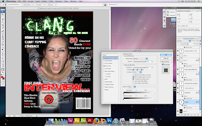
 This is a print screen of my computer screen, it includes me working on my front cover, the layers panel at the side and the effects toolbox which is used to change colour and add glow etc.
 For my front cover I used a lot of different texts, so I included a print screen of my layers panel at the right hand side of the photoshop screen, that displays all of the ones I used.
 This is my final copy of my front cover. I'm really happy with the result and think that it looks really good.
I think the main image is really strong, and I like the green and black colour scheme. I do think there could be more on the front page, as some parts of it look a bit bare, but I think the colours and the fonts are really good.
ReplyDeleteWhat I Like:
ReplyDelete- Main image is exciting and clear.
- Masthead is unusual and catches attention.
- All fonts are clear and easy to read.
What could be improved:
- Maybe more cover content like posters or something.
I really like the main image and the colour of the masthead.
ReplyDeleteIts been laid out really well just like a magazine would be like.